Russian school of Austin
Designing a website for a nonprofit organization called the Russian School of Austin following UX best practices.
Logo Design
The logo is designed to denote one of the most famous landmarks of Russia, St Basil's Cathedral and bathe it in Texan colours. The idea is to have a minimalist representation of the monument, to denote paint brushes and pencils which are the magical tools given to children in a school. Further, this logo denotes how families migrated to other nations carry a part of Russia wherever they go.

Type
- Personal Project
My Role
- User Researcher
- Interaction Designer
Project Timeline
- February 2017 - May 2017
Tools Used
- Sketch
- Qualtrics
UX best practices
- Heuristic Evaluation
- Ethnographic Study and Contextual Enquiry
- Persona Creation
- Prototyping and Storyboarding
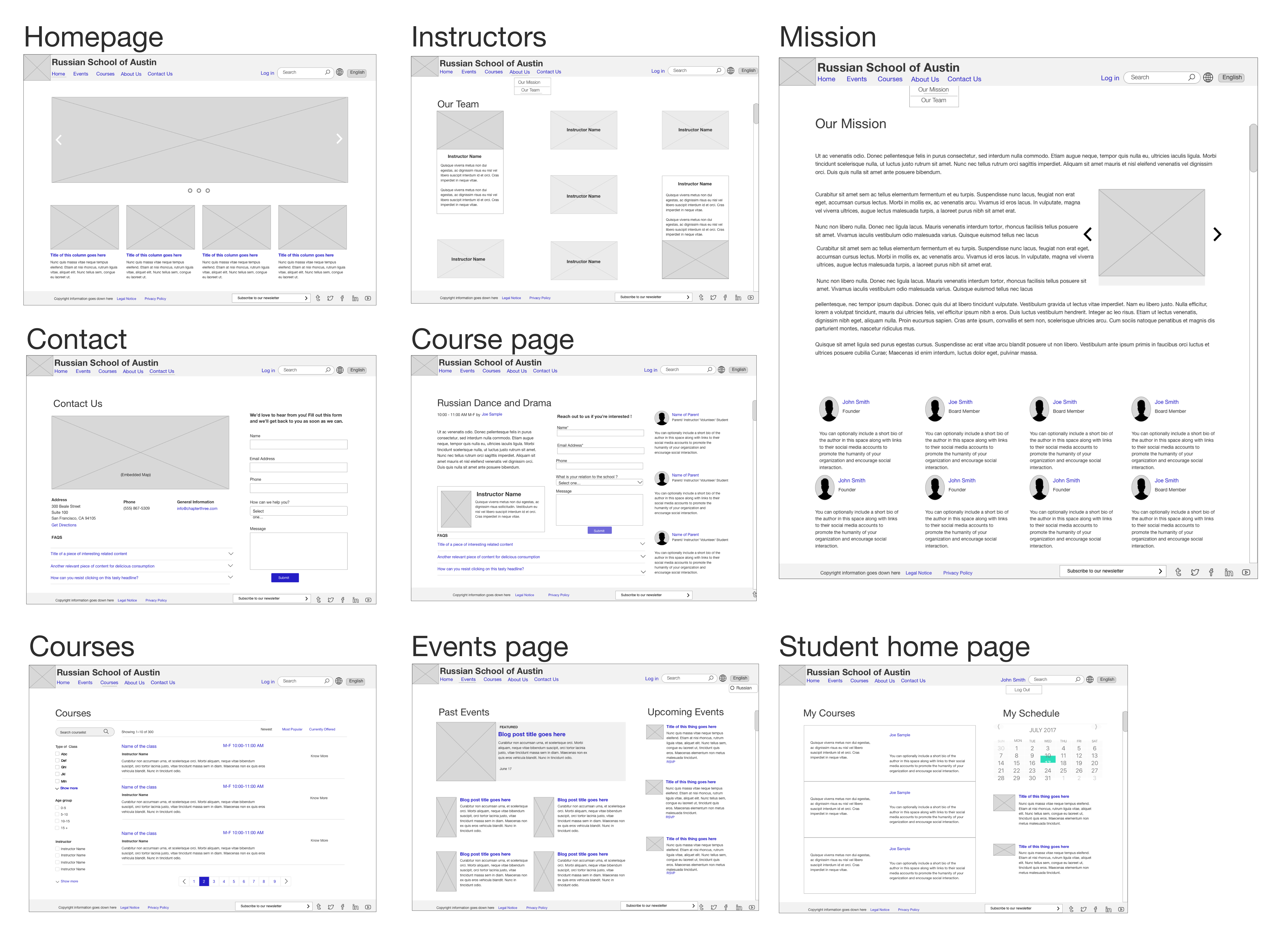
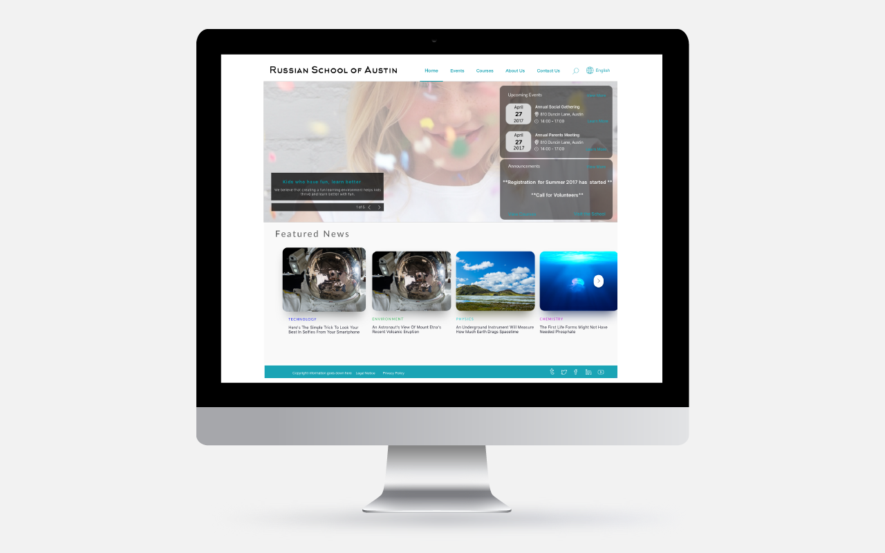
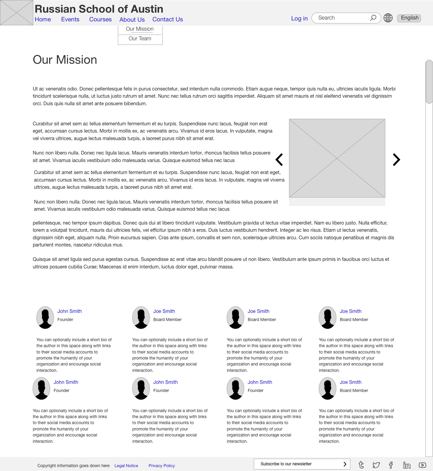
- Wireframes and Mockups
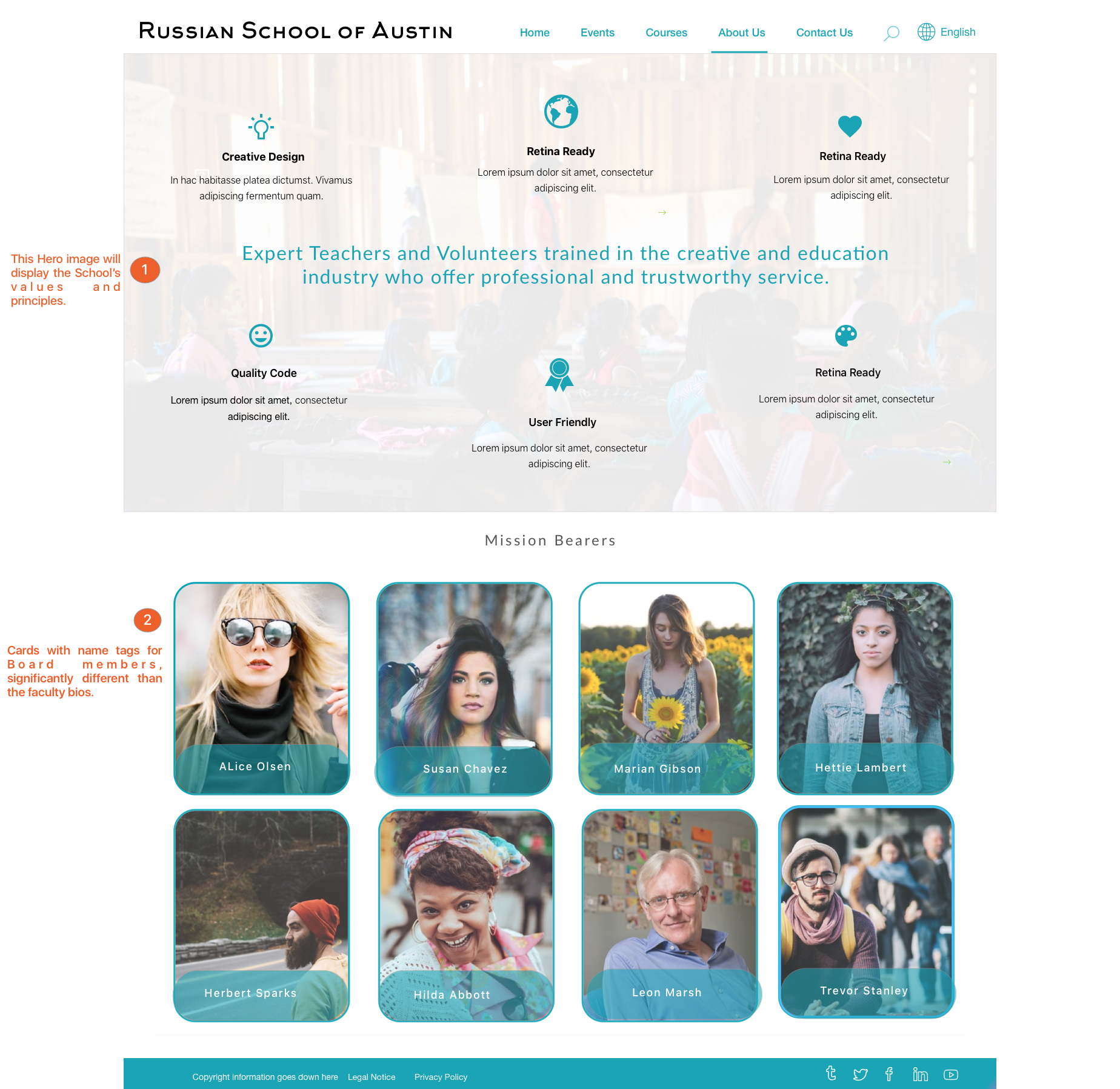
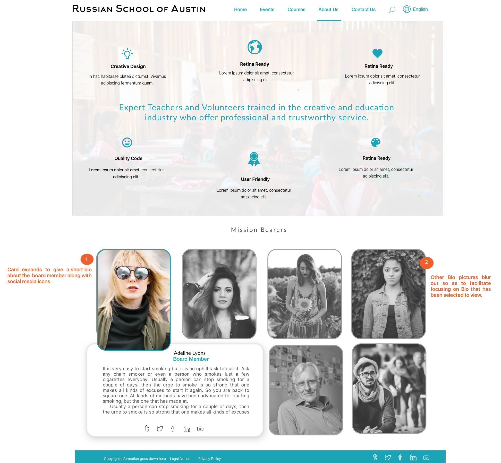
Purpose of the project
The Russian School of Austin is a community school that offers language classes to students. Currently, the school uses a Facebook group for communicating with students, parents and volunteers. The Facebook group is used to dissipate information regarding school events, academic calendars etc. The client, who sits on the board of the Russian School of Austin wanted an easy to use, easy to update website designed for the school with easy access to information about the school, course schedules and events.
Requirement Gathering
Ethnographic Study
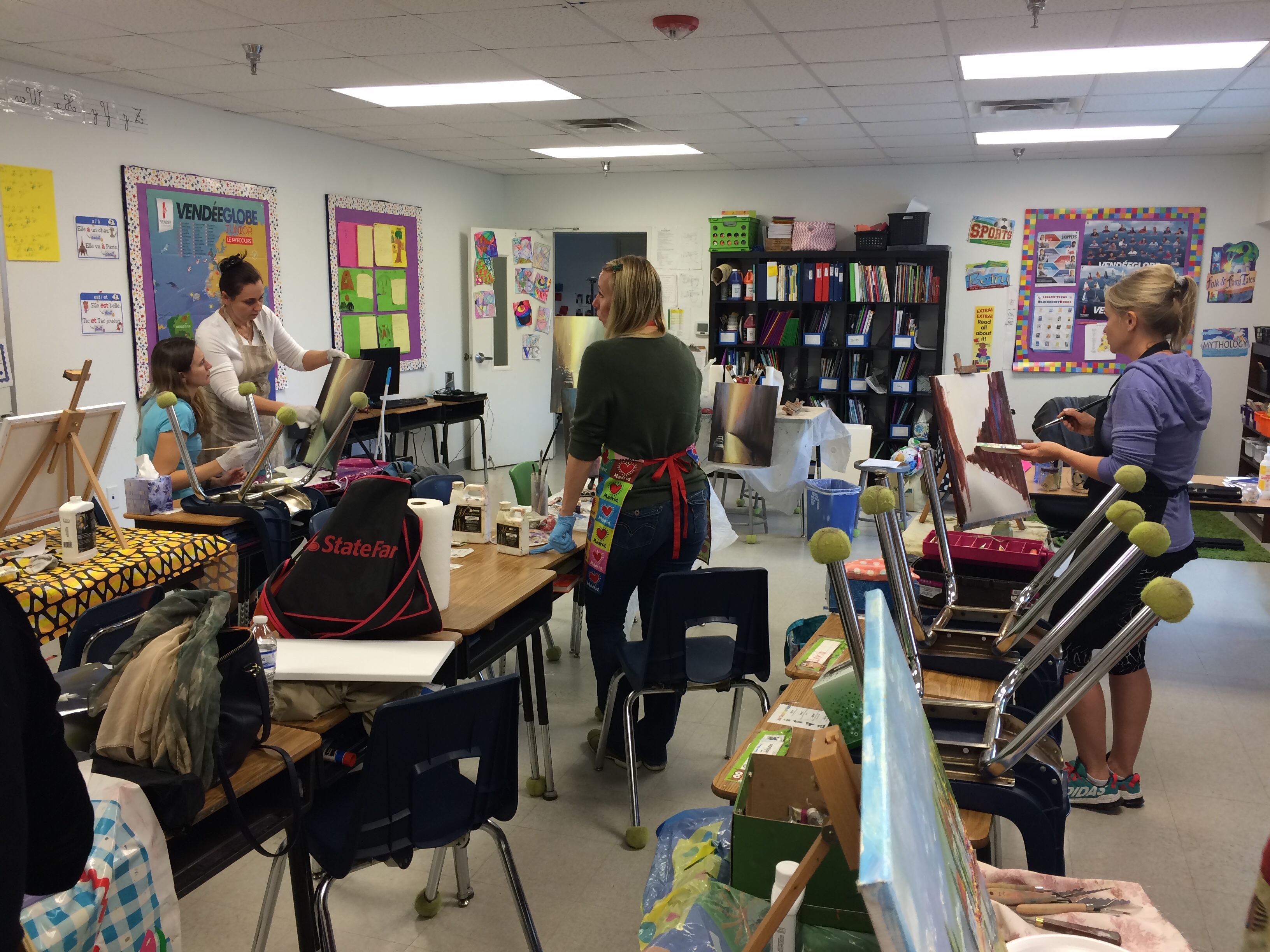
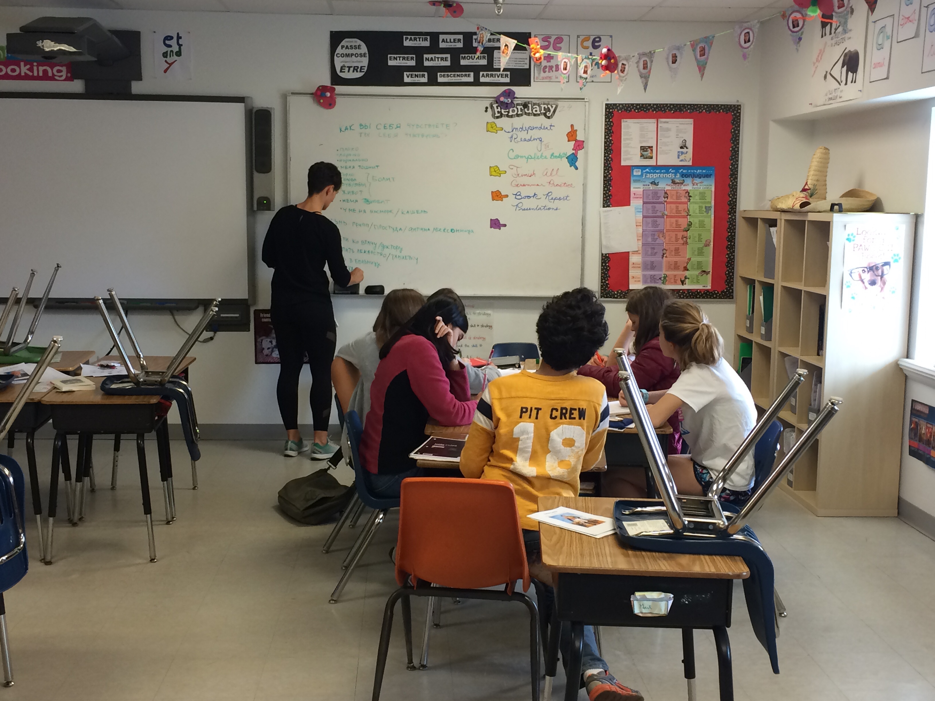
To design a website for the school, it was first important to understand how the different stakeholders in this existing system work together and interact. The purpose of the school visit was to observe a day in the life of a student and a teacher of the school to identify potential users, their behaviours and their expectations from the website. This research was useful in creating personas and making design decisions throughout the design process. The ethnographic study helped to provide a holistic view of the problem space and identify opportunities for design.
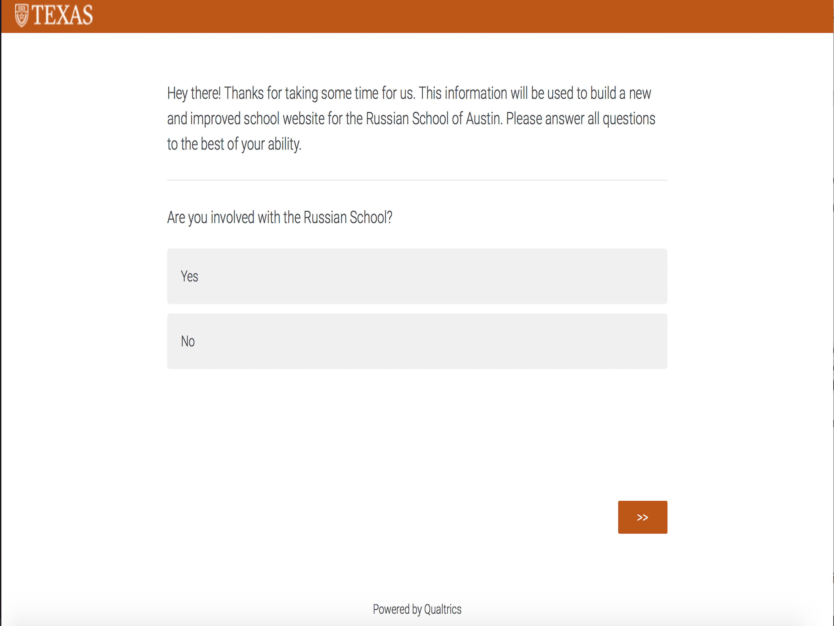
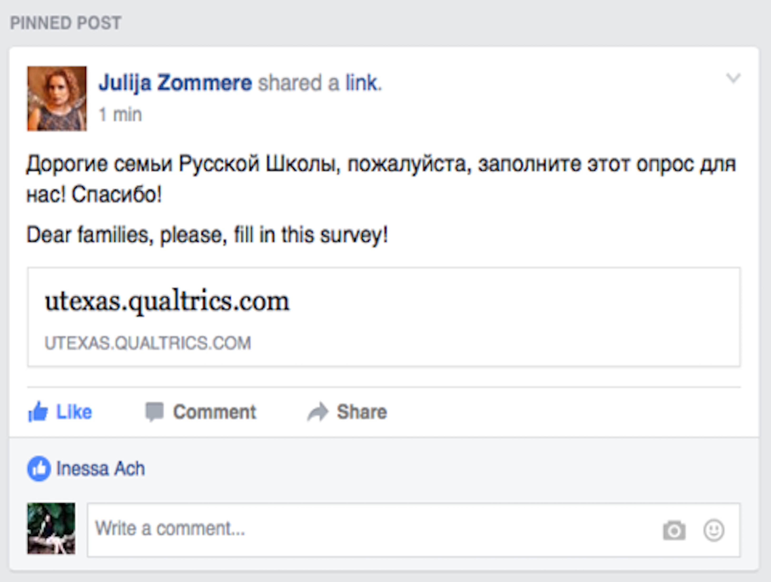
Survey Design
In-person interviews of the Director and the board members led to more significant insights coupled with results from survey conducted. The survey was posted on the current Facebook page of the school and families were encouraged to respond to the survey. The survey results and participant quotes led to the answering of some important design questions.
In-person interviews and survey result analysis
Current platforms used for dissipating information
- Email for sending announcements
- Closed Facebook group for enquiries and updates
I think it's perfect to have it as a Facebook group, since most people check Facebook several times a day anyway, they get the announcements in timely manner.
Joined the Facebook group to research how information is communicated in the group. Even though the board members wanted to move to a website and close the Facebook group, insights from the survey show that they should continue using the social media platform. UI design metaphors can be used to smooth the transition to the website.
Identified the pain points of current platform used
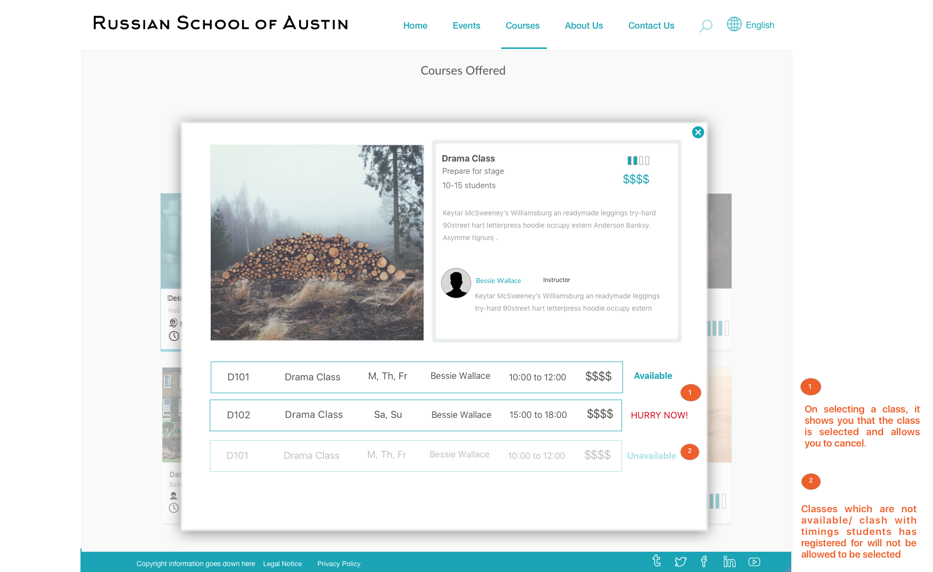
- Students are enrolled in incorrect level of classes due to confusion in scheduling classes
- School information is not easily accessible
- Lack of website makes the school seem ‘unprofessional’ and ‘unauthoritative’
"Given the features of FB, schedules and school open days are not at the top of the posts. I have to dig for class info. There is no info on teacher's bios, school policies on refunds, etc. Potentially, a place for student corner can be on the site. It would have to be in Russian. Even homework can be uploaded instead of distributed by email."
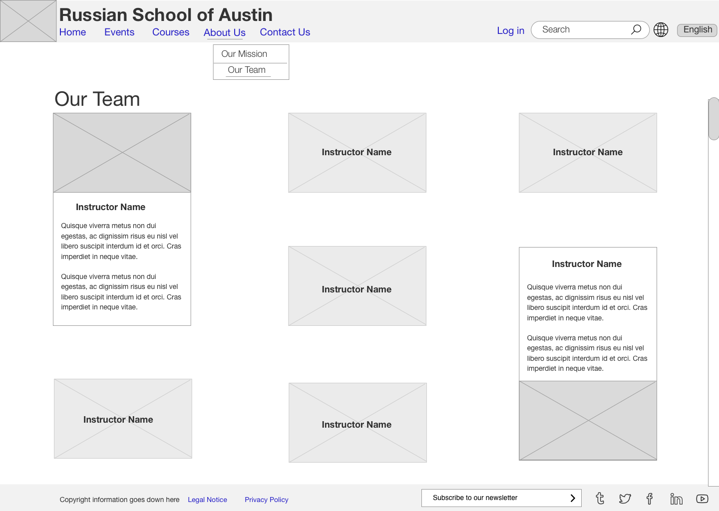
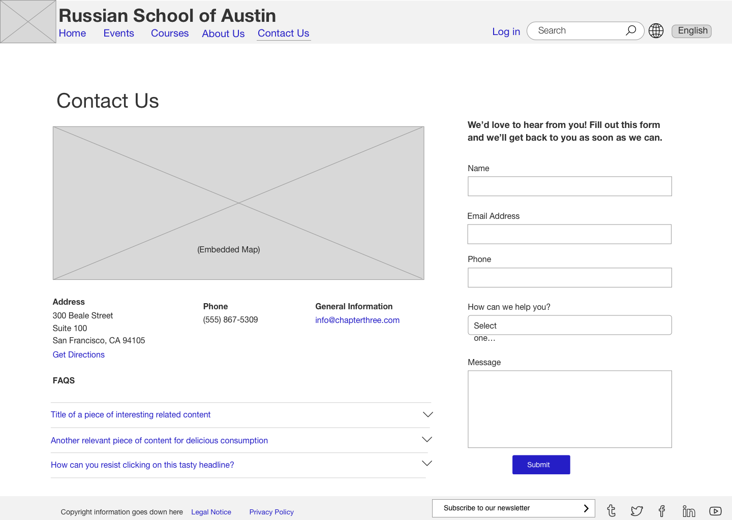
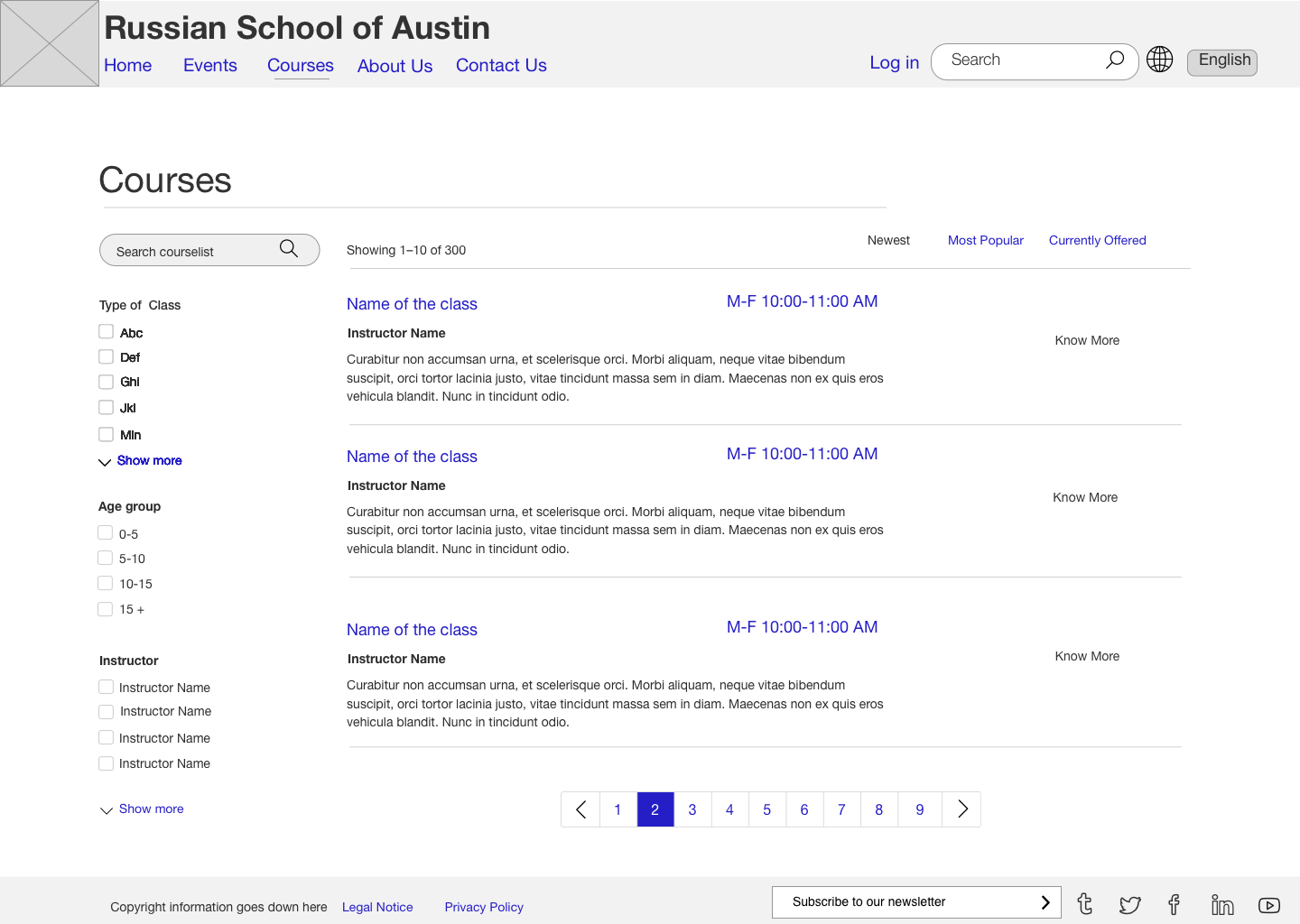
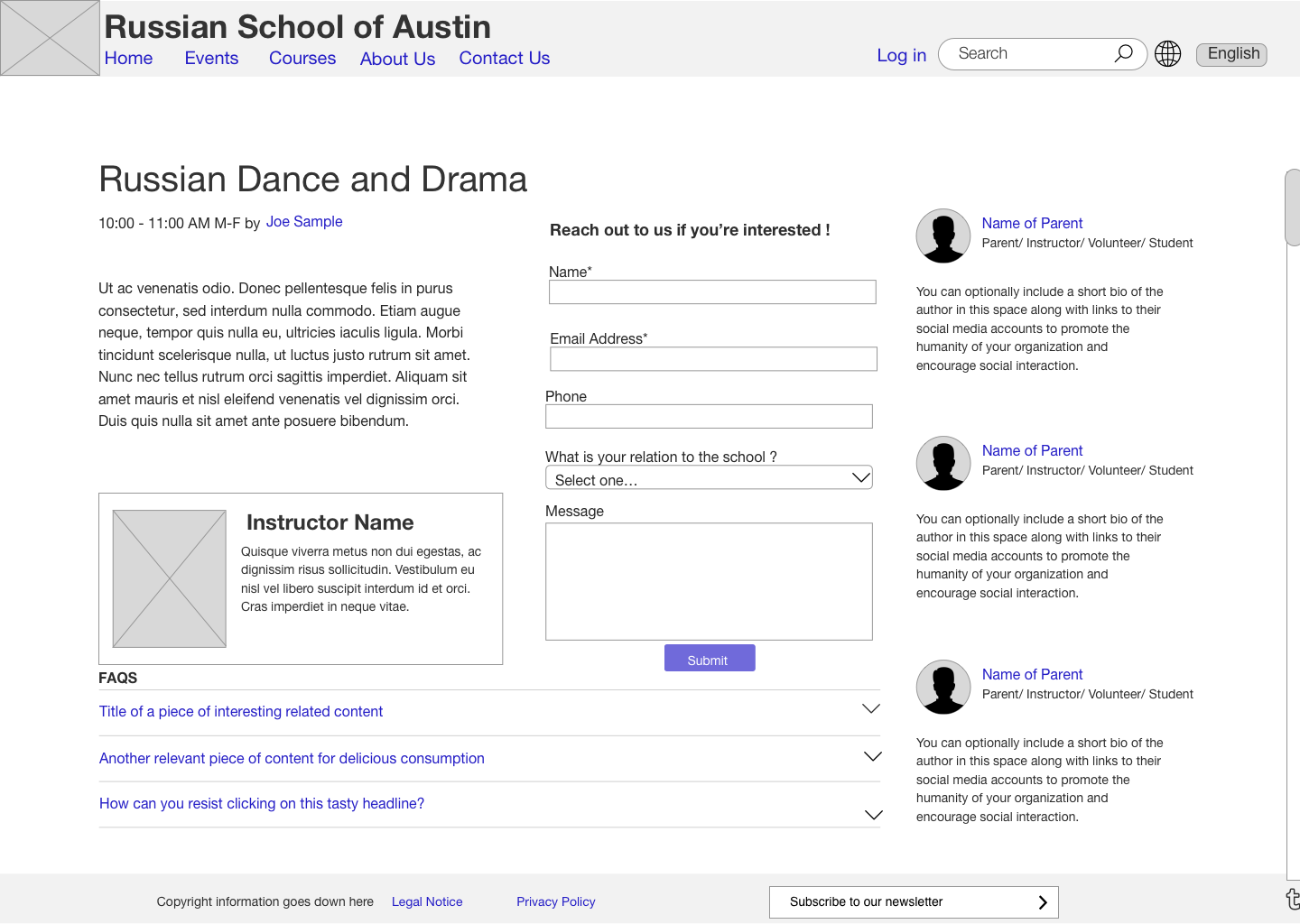
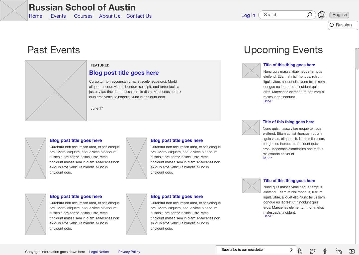
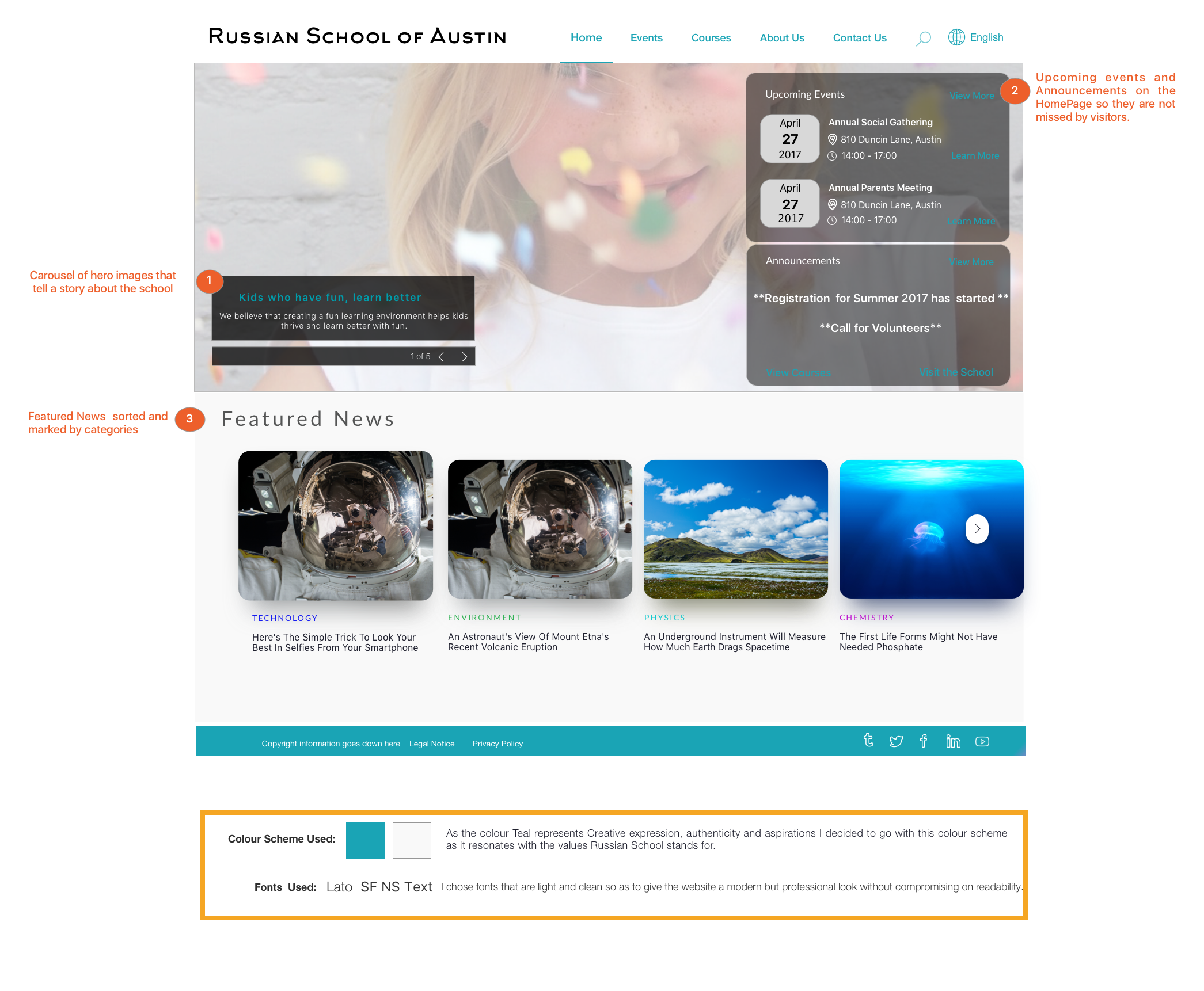
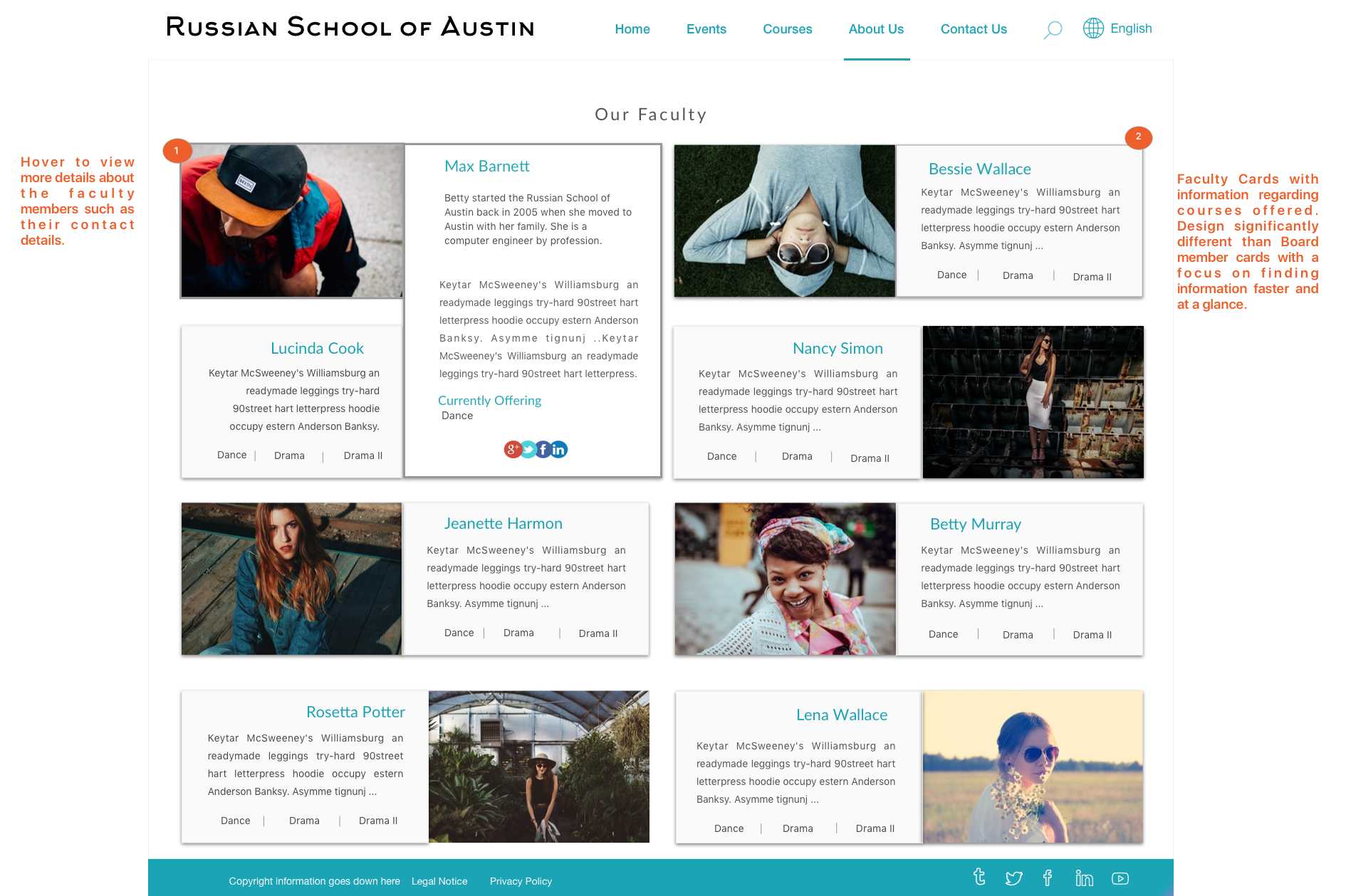
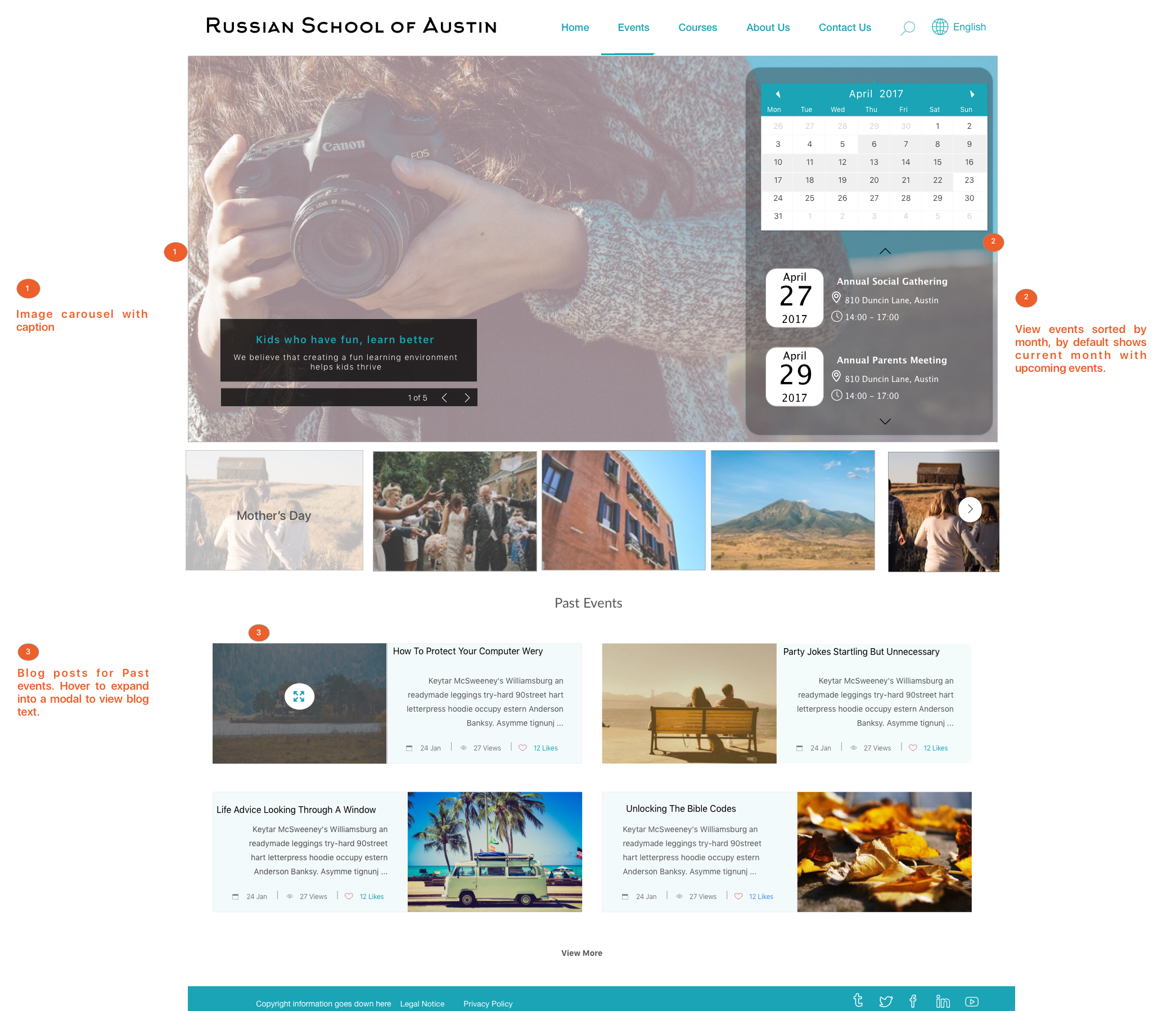
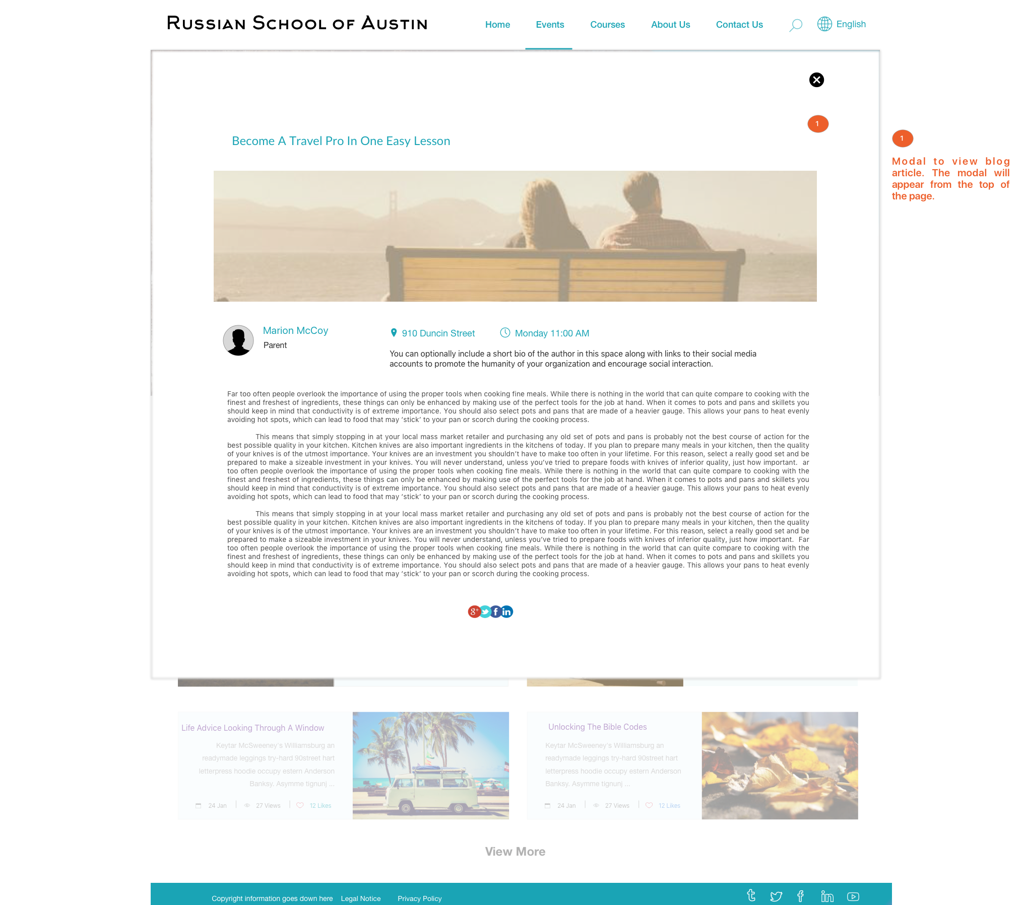
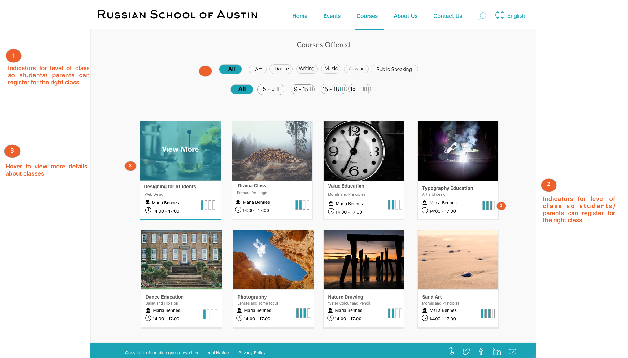
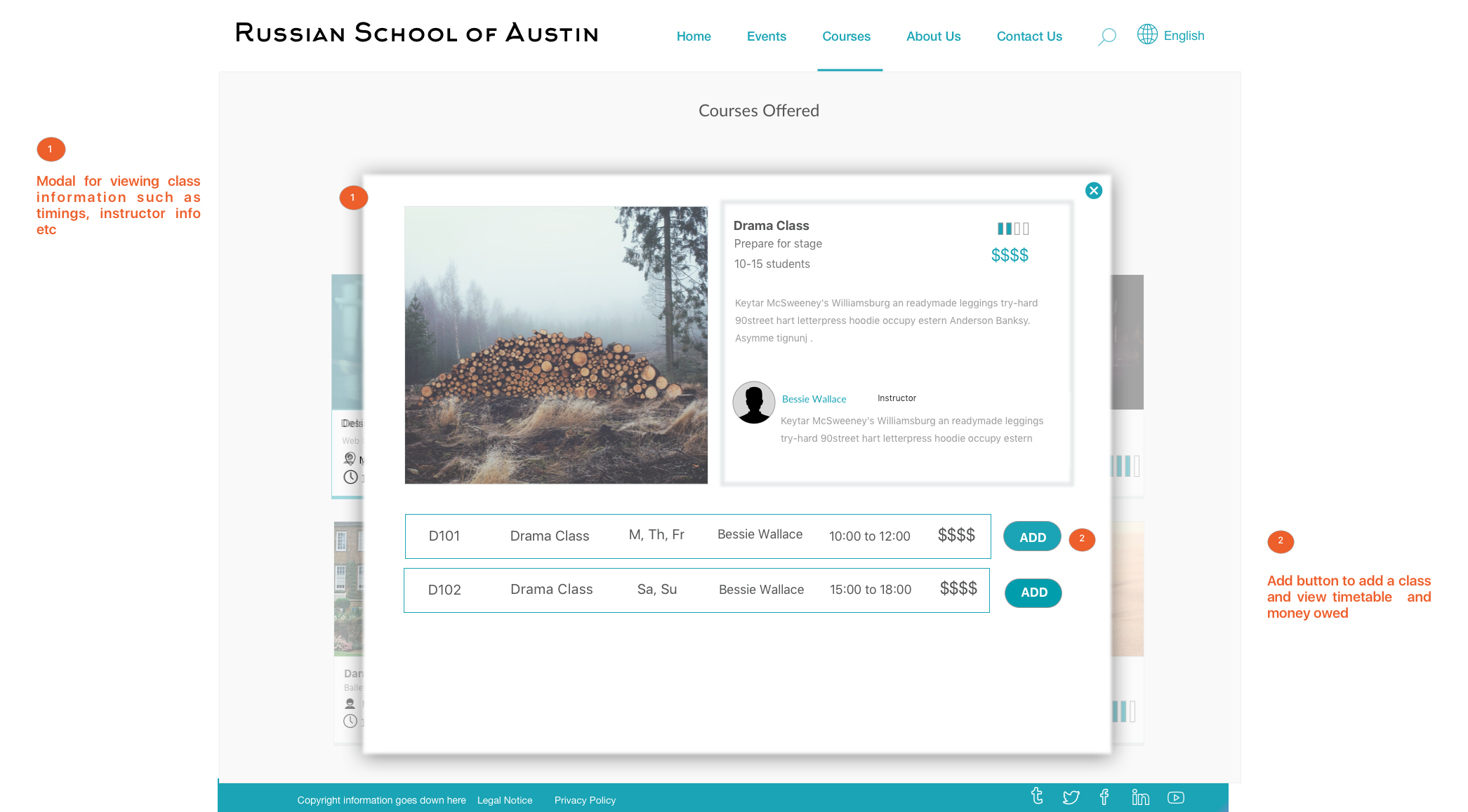
As the school administrator is a volunteer who is not skilled in web development, the website must be easy to use and update. Website should prominently display a schedule of classes offered and instructor bios, events details and contact details based on survey results.
"Its bad!! I'd quit FB all together, but forced to stay on it cause of things like Russ School, etc. it is not a platorm for communication, nor events."
Identifying the three main priorities of the website
- Make the school ‘findable’ and its information ‘searchable’
- Ease the chaos of scheduling classes currently done manually
- Communicate privately with the community
"On my son's primary school website, I primarily look for course schedules, homework and keep a tab on my son's homework and grades"
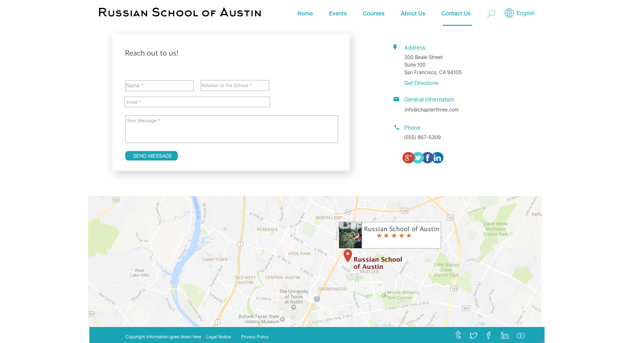
School’s contact information must be easy to access and the schedule of classes must be easy and intuitive to understand and interpret. There should be a forum for showcasing past events and a calendar for future events to bring the Russian community together. This helped design a plan for lean UX.
Language of the website
58.06% of the participants said that they would like to view the school website in either Russian and English with the ability to switch between the two. 3.23% participants said that they wanted to view the website in English only.
"I am okay with the default language being Russian. But my husband is American and he would like to know about Russian school more"
The default languauge of the website will be Russian with an option to change it to English. Option should be made visible on the homepage. As the school welcomes students who do not belong to Russian families, it is imperative that the website be accessible to all.
"Having the website in English is not good for the target audience; It Doesn't maintain the status of Russia. It is a Russian school therefore they need to use Russian language"
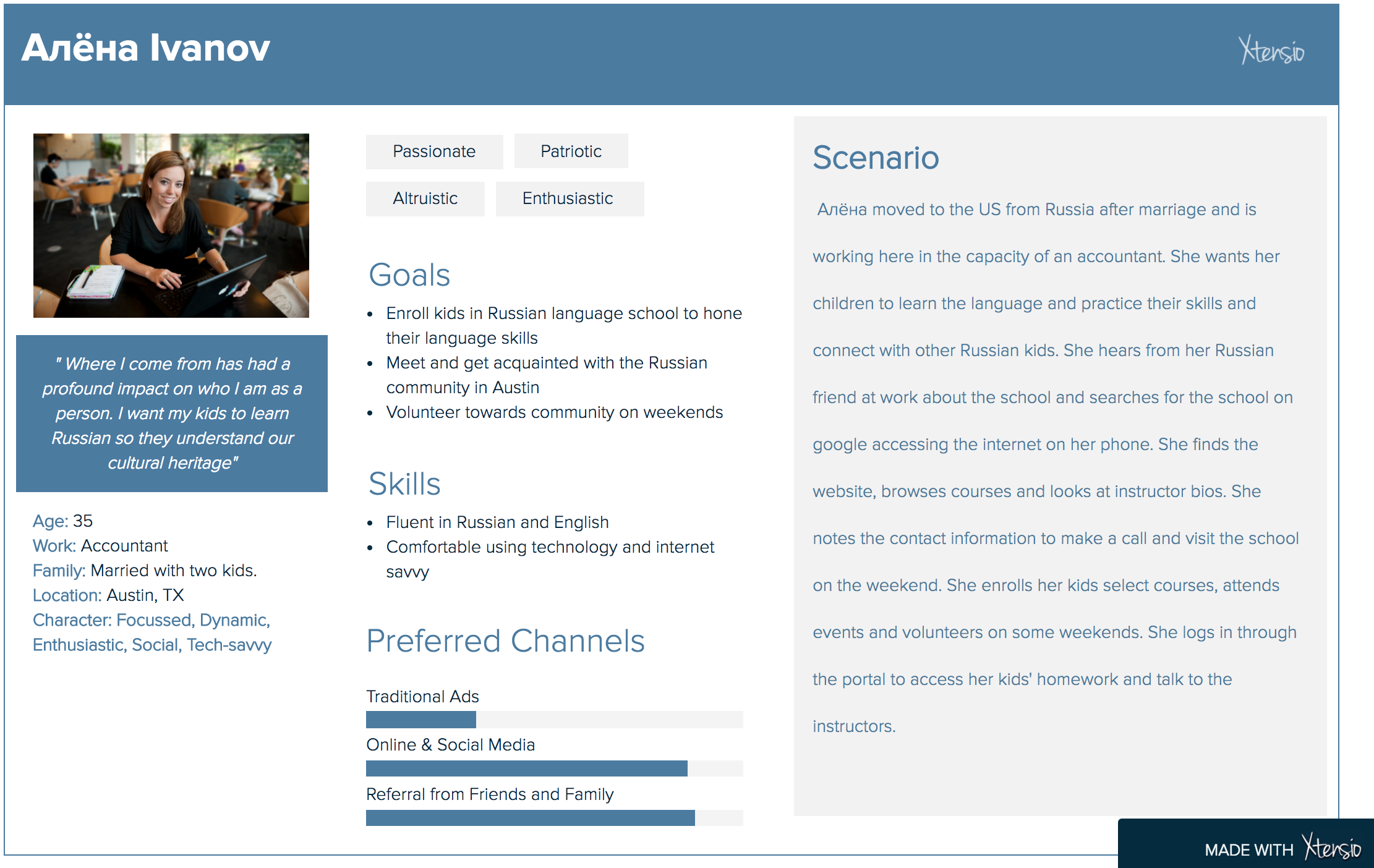
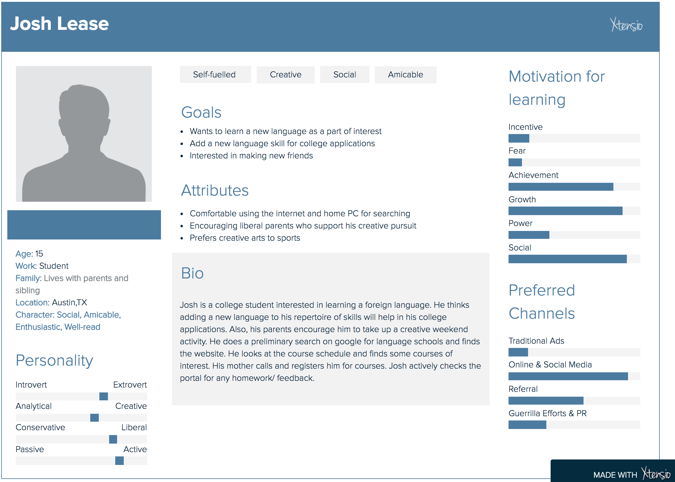
Persona Creation
Based on the information gleaned from the contextual enquiry, interviews and survey results, two most common personas were identified.
Competitive Analysis
Competitive analysis was conducted on educational websites to identify strengths and weakness of these sites.
Ideation and Design
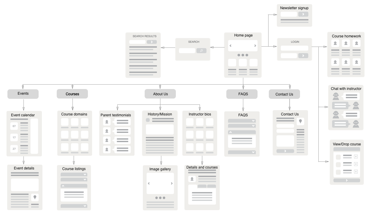
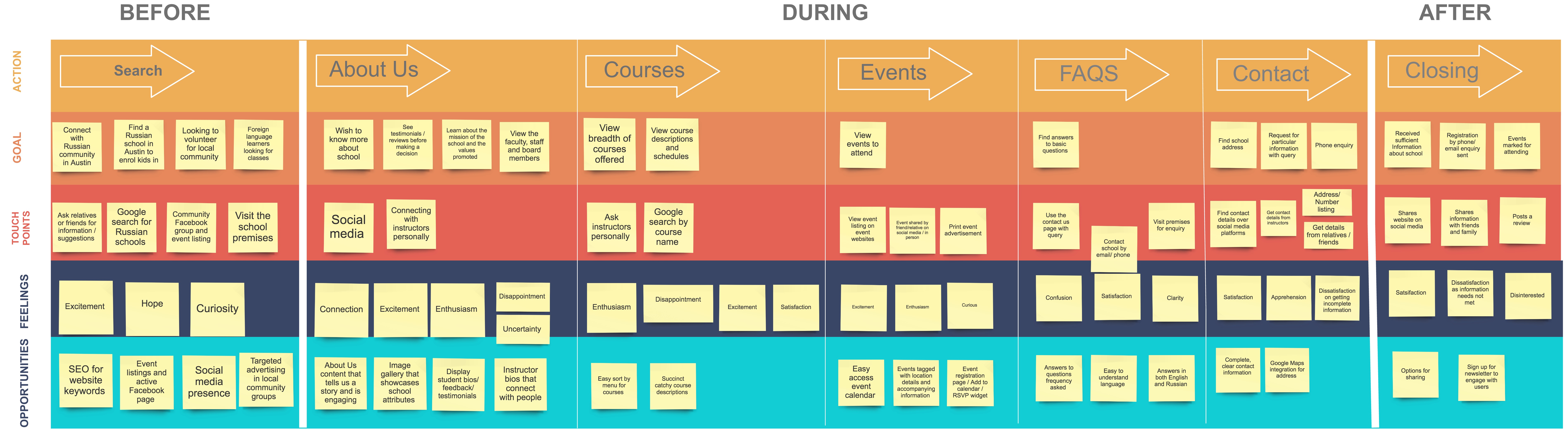
Sitemap and user journey maps were created to visualise how users will navigate the site, what sort of content they will need to support them in their goals and what sort of language they use to identify things. The sitemap was the first step in defining the navigation in the interface.
Click to view large size
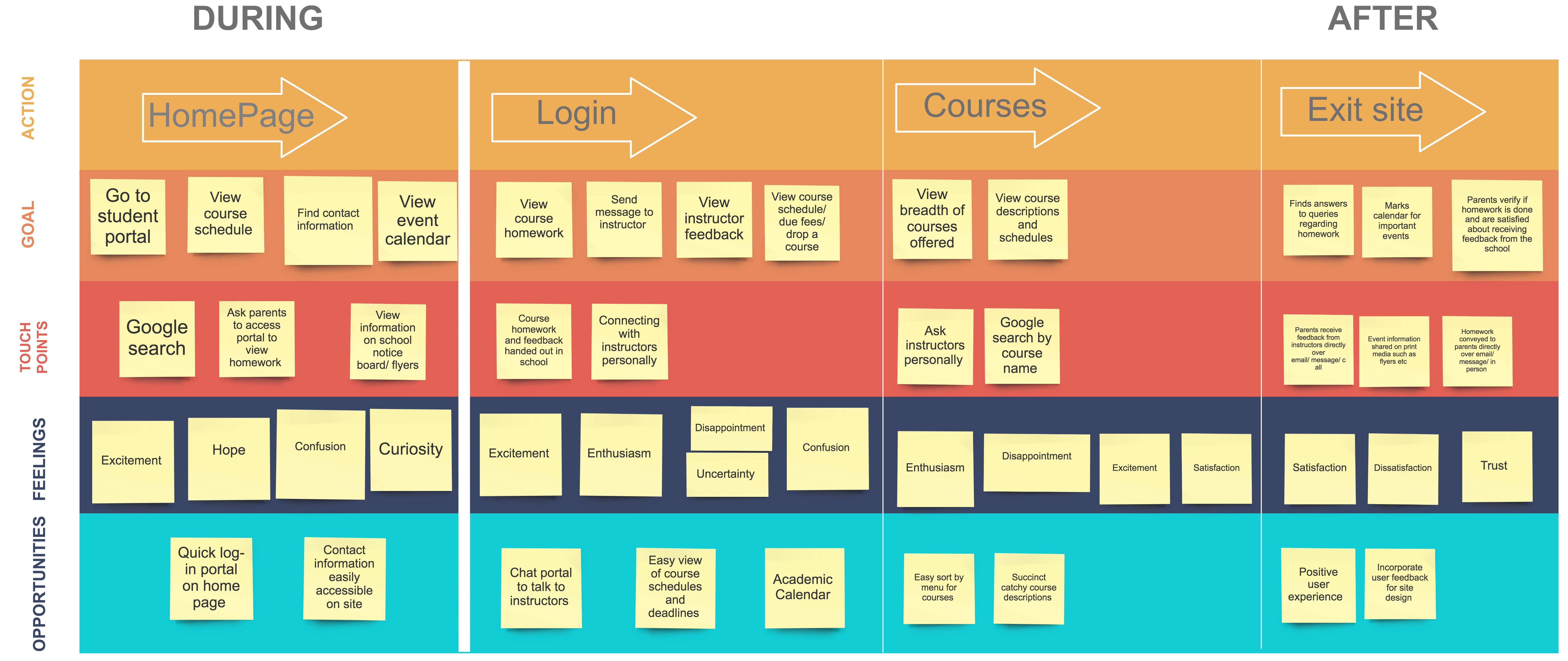
Current student user scenario
Click to view large size
Prospective student user scenario
Click to view large size